
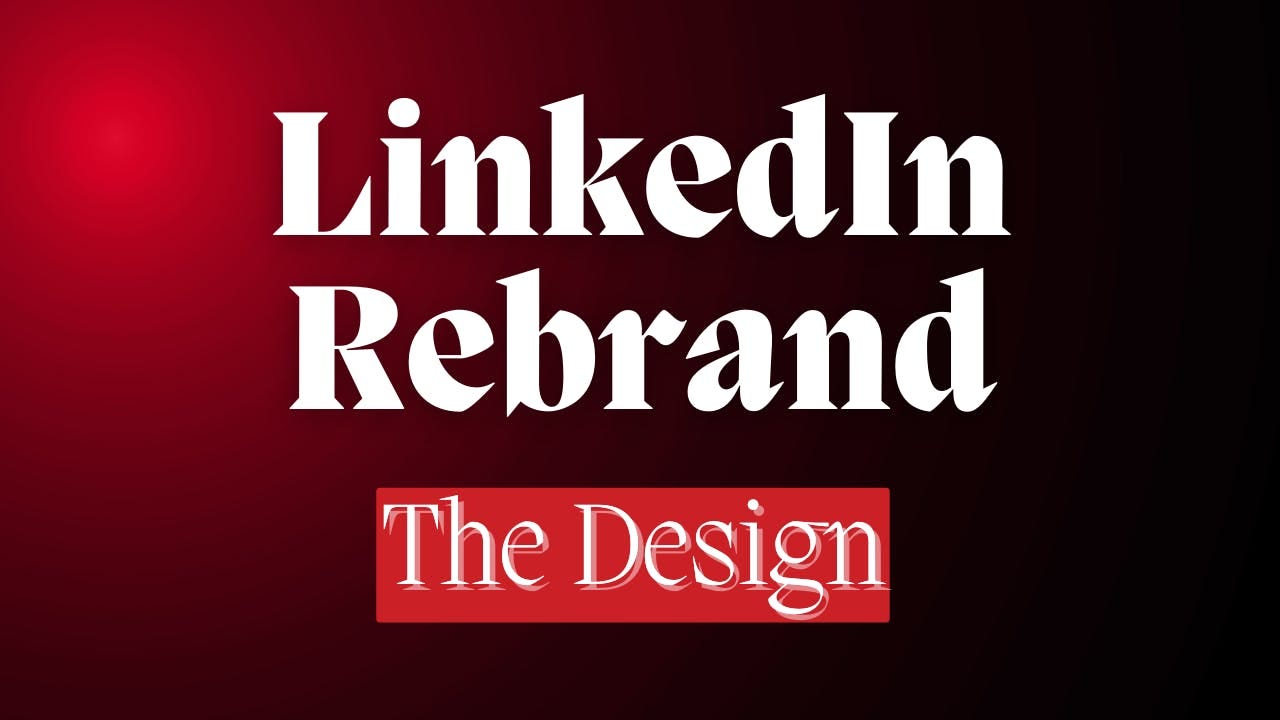
The "advanced" design guide for a LinkedIn visual brand identity
Design with "persona branding" in mind (LinkedIn edition)

Read on: misfit-way.com
Read time: 10 minutes
Follow: #personalrebrand
This guide is specifically useful when designing with "personal branding for LinkedIn" in mind.
And no, this is not a logo design tutorial.
In this article/post you'll learn how to design 2 things:
Cover banner
Featured section
The professional way.
For context:
You won't find me talking about design a lot, But when I do, you better expect it to be good.
I don't do design for visual aesthetics (anymore), I create functional problem-solving visuals.
I just wrapped up the redesign of my personal brand call-to-action visuals.
(I took inspiration from Tony Albrecht, Blair Sharp 🧀 , Luke Matthews, Nausheen I. Chen 🔥, Richard Moore LI profiles).
If my banner and featured section covers make you want to click then it's doing the right job.
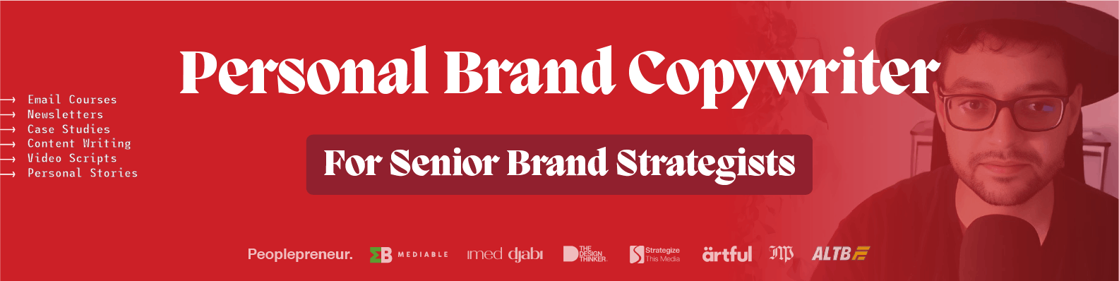
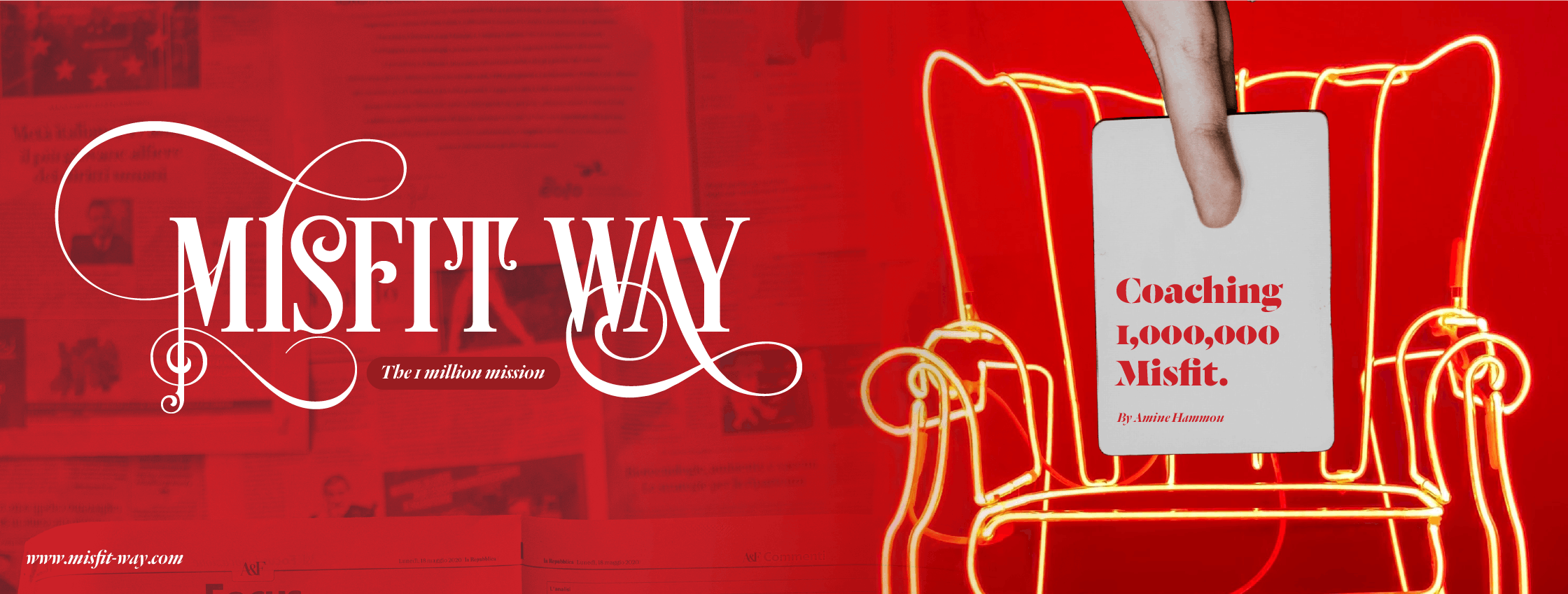
1) First the cover banner
Before I touched a single pixel, I had to come up with a pixel-perfect sentence that tells you what I'm about in 3 seconds or less.
After doing some personal brand research and working on my positioning. (Which you can read more about here: )
I came up with this tagline: "Personal brand copywriter for senior personal brand strategists"
Now to the design, it needs to highlight:
My tagline (what I do and who I do it for)
My clients/collaborations
My visual brand (face, colors, fonts, etc.)
The correct size: 1584 width x 396 height
Not BEING UNDERNEATH my profile picture (safe zone x white space)
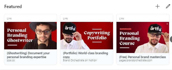
2) The featured section
I tried to use the rule of thirds.
No not the one with the 3x3 grid.
More like 3 personal branding principles to highlight what I do.
A way to capture/generate leads and give value upfront.
A way to show my work (let your work speak for itself first).
A way to book a call for the main service (when they're ready, I'm one call away).
As you can see in my featured section, The first 3 visuals do just that.
Although I wish LinkedIn worked more on their UX and split the featured section into 2 sections:
(Free) Resources
Services
While still keeping the same UI of their "featured section".
There isn't an "exact" size to use with LI-featured covers.
But I found this one to be more convenient: 480 width x 288 height.
Now why am I telling you about something that you can google yourself?
BECAUSE LinkedIn DID IT AGAIN! with the ugly UX.
I had the perfect sizing and the perfect wording.
But when I pinned it in the featured section for some reason,
The images were not at the same size, they were not equally proportionate.
This drives me mad and I wasted so much time testing and figuring this out so that you don't have to.
The solution is so dumb and simple:
LinkedIn featured section has different types of formats (link, media, post, newsletter, etc.).
The first 5 featured elements are the ones the viewer can see and scroll left or right.
The trick is that you have to use the same format for those 5 featured elements to get them to be equally aligned and proportionate (annoying RIGHT!).
As you can see in my featured sections, my first 5 elements are all in a "link" format.
That solved the problem (for now).
Since you've read so far, Let me tell you about...
Another redesign I did
I've created a visual distinction between:
The Brand Orchestrate (my personal branding business) and the Misfit Way (my creative misfit community).
What are the new changes?
(Mainly for the Misfit Way)
New logo with a minimal black style
New covers for the newsletter
New design for the ConvertKit newsletter template (Subscribe to my newsletter https://misfit-way/ to see it)
P.S. I already had the vision and visual direction for both, thanks to Eman Elhennawy & Imene Ben youssef for their brilliant help!
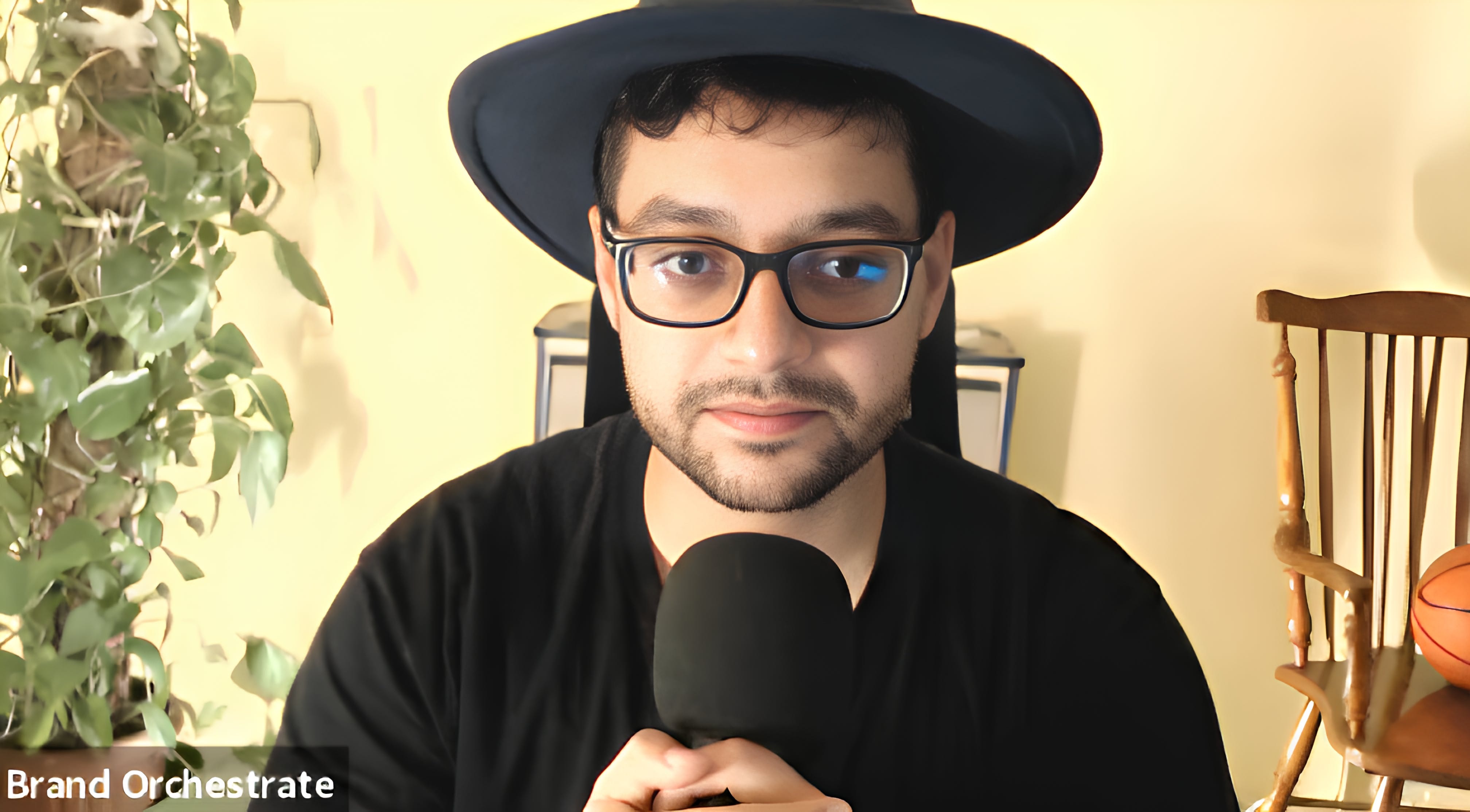
Not to mention,
My new wool fiber, British flat, brim felt, fedora podcast hat.
(That sounded exotic but it's just a cool hat, sorry not sorry David Pierce Tuttle 🎬)
If this guide is useful, share it with a friend.
If it isn't, share it with an enemy.
Stay tuned for part 5 of the #personalrebrand - Messaging
Plot twist:
The #personalrebrand series will be turned into an email course that drives, on average, an extra 20% of revenue to my branding business.
So if you are getting value out of this and you like my style of writing,
I can help you produce high-quality content that documents your expertise and takes your personal brand to the next level of authority, credibility, and industry recognition.
Email me "ghostwriting" to know more.
Till next week,
Your misfit friend.